Guest post by Peter B. Wylie
(Printer-friendly PDF download of this post available here: Lopsided Nature of Alum Giving – Wylie)
Eight years ago I wrote a piece called “Sports, Fund Raising, and the 80/20 Rule”. It had to do with how most alumni giving in higher education comes from a very small group of former students. Nobody was shocked or awed by the article. The sotto voce response seemed to be, “Thanks, Pete. We got that. Tell us something we don’t know.” That’s okay. It’s like my jokes. A lot of ’em don’t get more than a polite laugh; some get stone silence.
Anyway, time passed and I started working closely with John Sammis. Just about every week we’d look at a new alumni database, and over and over, we’d see the same thing. The top one percent of alumni givers had donated more than the other ninety-nine percent.
Finally, I decided to take a closer look at the lifetime giving data from seven schools that I thought covered a wide spectrum of higher education institutions in North America. Once again, I saw this huge lopsided phenomenon where a small, small group of alums were accounting for a whopping portion of the giving in each school. That’s when I went ahead and put this piece together.
What makes this one any different from the previous piece? For one thing, I think it gives you a more granular look at the lopsidedness, sort of like Google Maps allows you to really focus in on the names of tiny streets in a huge city. But more importantly, for this one I asked several people in advancement whose opinions I respect to comment on the data. After I show you that data, I’ll summarize some of what they had to say, and I’ll add in some thoughts of my own. After that, if you have a chance, I’d love to hear what you think. (Commenting on this blog has been turned off, but feel free to send an email to kevin.macdonell@gmail.com.)
The Data
I mentioned above that I looked at data from seven schools. After some agonizing, I decided I would end up putting you to sleep if I showed you all seven. So I chopped it down to four. Believe me, four is enough to make the point.
Here’s how I’ve laid out the data:
- For each of the four schools I ranked only the alumni givers (no other constituencies) into deciles (10 groups), centiles (100 groups), and milliles (1,000 groups), by total lifetime hard credit giving. (There is actually no such word as “milliles” in English; I have borrowed from the French.)
- In the first table in each set I’ve included all the givers. In the second table I’ve included only the top ten percent of givers. And in the third table I’ve included only the top one percent of givers. (The chart following the third table graphically conveys some of the information included in the third table.)
To make sure all this is clear, let’s go through the data for School A. Take a look at Table 1. It shows the lifetime giving for all alumni donors at the school divided into ten equal size groups called deciles. Notice that the alums in decile 10 account for over 95% of that giving. Conversely, the alums in decile 1 account for two tenths of one percent of the giving.
Table 1: Amount and Percentage of Total Lifetime Giving in School A for all Alumni by Giving Decile

Moving on to Table 2. Here we’re looking at only the top decile of alumni givers divided into one percent groups. What jumps out from this table is that the top one percent of all givers account for more than 80% of alumni lifetime giving. That’s five times as much as the remaining 99% of alumni givers.
Table 2: Amount and Percentage of Total Lifetime Giving at School A for Top Ten Percent of Alumni Donors

If that’s not lopsided enough for you, let’s look at Table 3 where the top one percent of alumni givers is divided up into what I’ve called milliles. That is, tenth of a percent groups. And lo and behold, the top one tenth of one percent of alumni donors account for more than 60% of alumni lifetime giving. Figure 1 shows the same information in a bit more dramatic way than does the table.
Table 3: Amount and Percentage of Total Lifetime Giving at School A for Top One Percent of Alumni Donors


What I’d recommend is that you go through the same kinds of tables and charts laid out below for Schools B, C, and D. Go as fast or as slowly as you’d like. Being somewhat impatient, I would focus on Figures 2-4. I think that’s where the real punch in these data resides.
Table 4: Amount and Percentage of Total Lifetime Giving in School B for all Alumni by Giving Decile

Table 5: Amount and Percentage of Total Lifetime Giving at School B for Top Ten Percent of Alumni Donors

Table 6: Amount and Percentage of Total Lifetime Giving at School B for Top One Percent of Alumni Donors


Table 7: Amount and Percentage of Total Lifetime Giving in School C for all Alumni by Giving Decile

Table 8: Amount and Percentage of Total Lifetime Giving at School C for Top Ten Percent of Alumni Donors
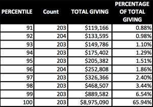
Table 9: Amount and Percentage of Total Lifetime Giving at School C for Top One Percent of Alumni Donors
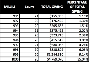

Table 10: Amount and Percentage of Total Lifetime Giving in School D for all Alumni by Giving Decile

Table 11: Amount and Percentage of Total Lifetime Giving at School D for Top Ten Percent of Alumni Donors

Table 12: Amount and Percentage of Total Lifetime Giving at School D for Top One Percent of Alumni Donors


When I boil down to its essence what you’ve just looked at for these three schools, here’s what I see:
- In School B over the half of the total giving is accounted for by three tenths of one percent of the givers.
- In School C we have pretty much the same situation as we have in School B.
- In School D over 60% of the total giving is accounted for by two tenths of one percent of the givers.
What Some People in Advancement have to Say about All This
Over the years I’ve gotten to know a number of thoughtful/idea-oriented folks in advancement. I asked several of them to comment on the data you’ve just seen. To protect the feelings of the people I didn’t ask, I’ll keep the commenters anonymous. They know who they are, and they know how much I appreciate their input.
Here are a few of the many helpful observations they made:
Most of the big money in campaigns and other advancement efforts does not come from alumni. I’m a bit embarrassed to admit that I had forgotten this fact. CASE puts out plenty of literature that confirms this. It is “friends” who carry the big load in higher education fundraising. At least two of the commenters pointed out that we could look at that fact as a sad commentary on the hundreds and hundreds of thousands of alums who give little or nothing to their alma maters. However, both felt it was better to look at these meager givers as an untapped resource that we have to do a better job of reaching.
The data we see here reflect the distribution of wealth in society. The commenter said, “There simply are very few people who have large amounts of disposable wealth and a whole lot of hard working folks who are just trying to participate in making a difference.” I like this comment; it jibes with my sense of the reality out there.
“It is easier (and more comfortable) to work with donors rather than prospective donors.” The commenter went on to say: “The wealthier the constituency the more you can get away with this approach because you have enough people who can make mega-gifts and that enables you to avoid building the middle of the gift pyramid.” This is very consistent with what some other commenters had to say about donors in the middle of the pyramid — donors who don’t get enough attention from the major giving folks in advancement.
Most people in advancement ARE aware of the lopsidedness. All of the commenters said they felt people in advancement were well aware of the lopsided phenomenon, perhaps not to the level of granularity displayed in this piece. But well aware, nonetheless.
What you see in this piece underestimates the skew because it doesn’t include non-givers. I was hoping that none of the commenters would bring up this fact because I had not (and still have not) come up with a clear, simple way to convey what the commenter had pointed out. But let’s see if I can give you an example. Look at Figure 4. It shows that one tenth of one percent of alumni givers account for over 48% of total alumni giving. However, let’s imagine that half of the solicitable alumni in this school have given nothing at all. Okay, if we now double the base to include all alums, not just alum givers, then what happens to the percentage size of that top one tenth of one percent of givers? It’s no longer one tenth of one percent; it’s now one twentieth of one percent. If you’re confused, let’s ask someone else reading this thing to explain it. I’m spinning my wheels.
One More Thought from Me
But here’s a thought that I’ve had for a long time. When I look at the incredible skewness that we see in the top one percent of alumni donors, I say, “WHY?!” Is the difference among the top millile and the bottom millile in that top one percent simply a function of capacity to give? Maybe it is, but I’d like to know. And then I say, call me crazy, LET’S FIND OUT! Not with some online survey. That won’t cut it. Let’s hire a first rate survey research team to go out and interview these folks (we’re not talking a lot of people here). Would that cost some money to go out and get these answers? Yes, and it would be worth every penny of it. The potential funding sources I’ve talked to yawn at the idea. But I’ll certainly never let go of it.
As always, let us know what you think.